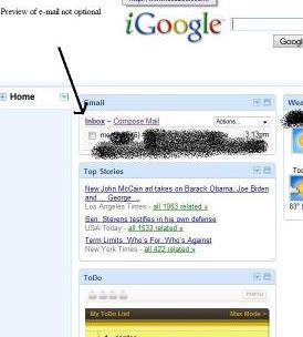
Anyone else use iGoogle? I do, and I love it - or I did, till the past few days. They've made some changes, against the advice of their community of testers who HATED the changes, AND given us no option to continue using the old format.
Old format (just the side of the page with the mail gadget):

New format:

I realize it's a free service (at least it is to me, though there is a pay option), and I don't have to use it, but that just doesn't seem like good business to me. Plus, a lot of the members who are complaining DO pay for the service!
THE main problem (to me) is the new version of the Gmail gadget. Used to be it would show you when you have new messages, by simply putting the number of messages there. You could choose whether you wanted to show a preview of the messages, or you could choose to hide the preview. I never really thought too much about that. I don't like a cluttered page (that to-do list is there on a trial basis ) and I also don't need anyone else in my family seeing the first few sentences of my mail when they bring up the Google page. Not that there's anything bad in my mail, LOL! I just don't choose to use the preview feature. But people who use iGoogle in their workplace DO have a problem with the fact that it is now no longer an option -- if you have the iGoogle page up, and the mail gadget on the page, there WILL be a preview of your e-mails - any number you choose, from 1 to 10, note that zero is NOT an option. It's a serious privacy issue. One would think it was just a bug, but it made it through testing and all its complaints.
I don't like the new page for other reasons, but the mail is the biggie for me. In the new one, they also moved the Home tab to the left, which many are also complaining about. I can live with that. I don't care what it LOOKS like. But they changed the way the mail functions. Gmail was easy to use -- No longer. It's more complicated now just to read the mail, much less reply and add attachments. It's a serious pain! I confess I am set in my ways and don't like a lot of changes, but why fix what wasn't broken? Better still - why FORCE it on people? Let those who want it, choose it. Let those of us who like it the old way, keep that. It's done all the time when "improvements" are made.
I found a Google discussion group and discovered a temporary fix for the problem - I set my home page to the Canadian version of iGoogle. See, this "improvement" is only for those of us in the US, for now. But it won't last forever. Quote:
Great! I know my Canadian friend can't wait. *rolling eyes*
And here's what the Google rep in the Help Group had to say:
Well, Paul - important to whom? Not to your members, apparently, who have posted 10 pages of complaints on your Help Group? Not to the testers who begged Google to NOT make the changes? And apparently the customer is not important to Google. Suck it up and learn to like it, eh? Nice business model, I wonder if they also sell futons?
Old format (just the side of the page with the mail gadget):

New format:

I realize it's a free service (at least it is to me, though there is a pay option), and I don't have to use it, but that just doesn't seem like good business to me. Plus, a lot of the members who are complaining DO pay for the service!
THE main problem (to me) is the new version of the Gmail gadget. Used to be it would show you when you have new messages, by simply putting the number of messages there. You could choose whether you wanted to show a preview of the messages, or you could choose to hide the preview. I never really thought too much about that. I don't like a cluttered page (that to-do list is there on a trial basis
I don't like the new page for other reasons, but the mail is the biggie for me. In the new one, they also moved the Home tab to the left, which many are also complaining about. I can live with that. I don't care what it LOOKS like. But they changed the way the mail functions. Gmail was easy to use -- No longer. It's more complicated now just to read the mail, much less reply and add attachments. It's a serious pain! I confess I am set in my ways and don't like a lot of changes, but why fix what wasn't broken? Better still - why FORCE it on people? Let those who want it, choose it. Let those of us who like it the old way, keep that. It's done all the time when "improvements" are made.
I found a Google discussion group and discovered a temporary fix for the problem - I set my home page to the Canadian version of iGoogle.
| The Official Google Blog : |
| Not in the U.S.? Don't worry. We'll also be rolling out this updated version in other countries very soon. |
Great! I know my Canadian friend can't wait. *rolling eyes*
And here's what the Google rep in the Help Group had to say:
| Quote: |
| Canvas view of gadgets (and its accompanying left-side navigation) is an important new iGoogle feature, so the old look is being retired. -Paul iGoogle Guide |
Well, Paul - important to whom? Not to your members, apparently, who have posted 10 pages of complaints on your Help Group? Not to the testers who begged Google to NOT make the changes? And apparently the customer is not important to Google. Suck it up and learn to like it, eh? Nice business model, I wonder if they also sell futons?

No comments:
Post a Comment